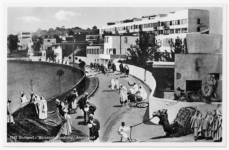
“Weissenhofsiedlung, Arab Village.” Postcard with photomontage of the Weissenhofsiedlung, Stuttgart, ca. 1927. Published by Schwäbischer Kunst-Verlag Hans Boetticher, Stuttgart.
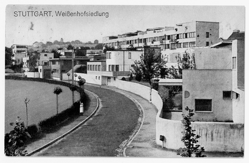
Ludwig Mies van der Rohe (master plan). Weissenhofsiedlung, Stuttgart, 1927. Postcard.
One of the most famous examples of twentieth-century architectural modernism is the Weissenhofsiedlung near Stuttgart, a model housing complex designed in 1927 by Mies van der Rohe, with single-family houses and housing designed by Le Corbusier, Peter Behrens, Bruno Taut, and a dozen other renowned architects from the 1920s.1 The Weissenhof’s fame rests, however, on its notoriety: it became widely known partly thanks to a photomontage that denounced the white, flat-roof, cube-shape building ensemble as an “Arab village,” depicted complete with camels, a lion, and burnoose-clad Bedouins.2 Besides the fact that this anonymous, racist image used the typically left-wing or Dada technique of photomontage, what strikes me is that this cartoonish take on the Weissenhofsiedlung implies an “original,” presumably also a postcard, taken from the same angle and perspective.3 It turns out the original postcard does exist. Via the defamatory “faking” of a famous urbanist landmark, a visual medium of modernity comes into view, a medium that has largely escaped scholarly attention: the architectural postcard.
A few years ago, I was researching the link between film, architecture, and urbanism in Weimar Germany and was puzzled that so few of the modernist buildings and housing schemes of Das Neue Bauen (The New Building), of the Bauhaus, and of the so-called International Style were depicted on film.4 Why, with the exception of Hans Richter’s Die neue Wohnung (1930) and Pierre Chenal’s L’architecture d’aujourd’hui (1930), had virtually no films, and especially no avant-garde films, recorded or celebrated this key aspect of modernism?5 What had happened to the alliance between the Congrès internationaux d’architecture moderne (CIAM), meeting in La Sarraz in June 1928, and the Congrès international du cinéma indépendant et moderne (CICIM), which in 1929 came together at the same location?6
Somewhere, I felt, a link had gone missing, or an inhibiting factor had been overlooked. I eventually came across statements by architects themselves – notably Bruno Taut and Mies van der Rohe – who, while in other respects enthusiasts of avant-garde (as well as popular) cinema, nonetheless expressed reluctance to have their buildings filmed.7 In cases where they did allow a film camera, they tended to use only certain shots as stills, in order to illustrate their books, articles, or pamphlets. In one sense, the reason was simple enough: it was a matter of power and control. Architects felt that once a motion picture camera was in charge, they could no longer determine the angle or point of view from which their building was viewed; hence the marked preference for still photography or single-frame layouts. Individual buildings, such as Mies van der Rohe’s Villa Tugendhat in Brno or his Barcelona Pavilion, were like the great movie stars who, when “ready for their close-up,” knew which side of the face or exactly what angle of the nose to present to the camera.8 Fritz Höger’s Chilehaus in Hamburg, for instance, is an icon of architectural history precisely because it can seemingly be viewed from only one angle – the one immortalized by a postcard. The risk of modern architecture making bella figura expressly for the camera at the expense of function and clarity is also the topic of Wilhelm Lotz’s remarkably perspicacious 1929 essay “Architecture Photographs.” Lotz notes,
a danger is evident in current architecture photography – one to which nearly all photographers succumb to varying degrees, and not only the photographers but also the architects who have their buildings photographed…. For all too often the photographer is anxious to turn his photographs into good and interesting pictures. To him the impression the photograph makes as an interesting representation and an interesting detail is more important than a clear and objective [sachlich] representation of the object. Such artistic ambitions on the part of the photographer are even more evident when there is a noticeable effort to choose the most interesting possible viewpoint.9
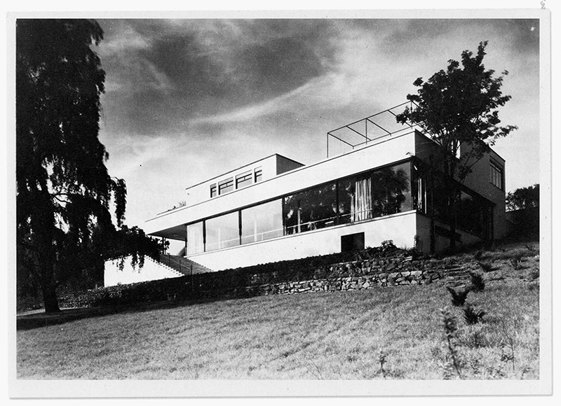
Ludwig Mies van der Rohe. Villa Tugendhat, Brno, 1928–1930. Postcard.
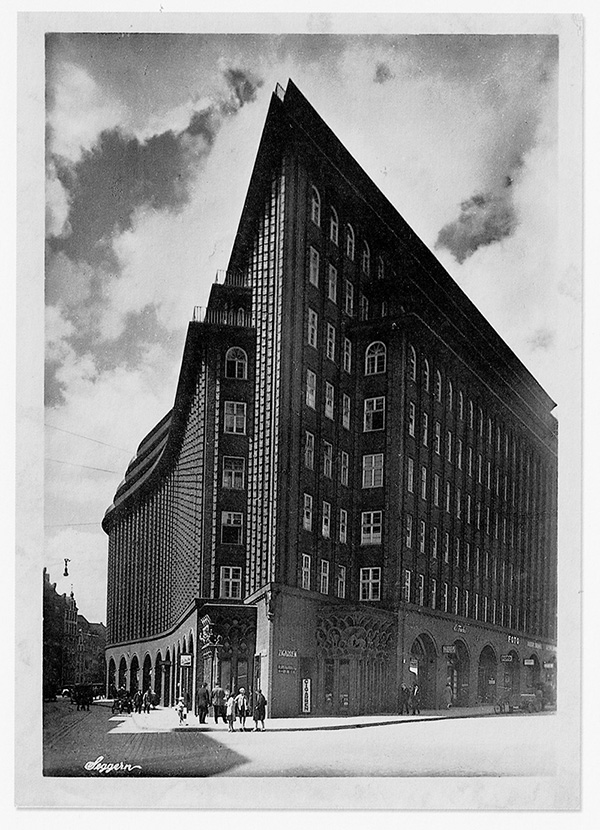
Fritz Höger. Chilehaus, Hamburg, 1924. Postcard with photograph by Georg Toepffer.
This points to a historical continuity across the radical break posited by modern architecture, since it connects the 1920s with Adolf von Hildebrand’s 1893 book on the relief, Das Problem der Form in der bildenden Kunst (The Problem of Form in Painting and Sculpture). In this text, Hildebrand insists on the relief as a counterform to sculpture-in-the round, which requires movement, because only relief sculpture ensures that beholders are not tempted to displace themselves and take in the “wrong” view. The same desire to immobilize the spectator still seems to be at work in the 1920s, suggesting not only the residual power of perspectival projection even after cubism and expressionism but hinting at a more general kinetophobia, which in turn underlines just how crucial – or traumatic – mobility was to become in modernist architectural discourse.10
One is reminded of both Le Corbusier and Sergei Eisenstein at the Parthenon, extolling the three-quarter or angled view. The history of that view is so long that it may well connect twentieth-century architectural postcards to the Greek temples and other sacred spaces – raising further questions of bodily displacement and Euclidian geometry, questions tentatively resolved in the promenade architecturale.11
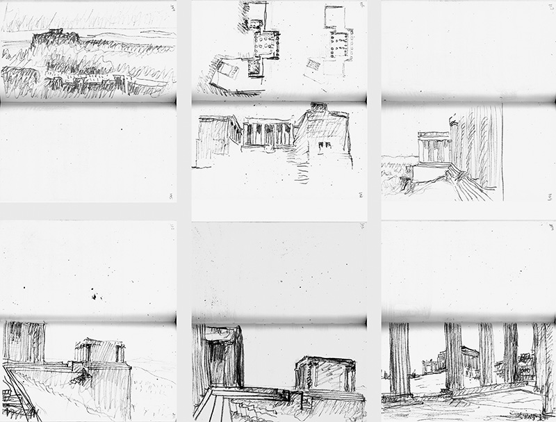
Le Corbusier. Series of sketches made during a visit to the Acropolis, 1911. From Le Corbusier, Voyage d’Orient (1910–1911), carnet 6.
The issue of the view also highlights an unresolved tension between movement and stasis in modernism: its simultaneous infatuation with and anxiety about mobility. The Bauhaus and constructivist wing of the modern movement, with its reliance on straight lines, on geometric forms and the grid – in contrast to expressionist architecture’s flowing lines – did not always come to terms with motion and mobility, these key signifiers of the city, of cinema, and of modern urban life.12 Siegfried Giedion’s description of Le Corbusier’s row of houses in the Pessac development is emblematic:
Still photography does not capture them clearly. One would have to accompany the eye as it moves: only film can make the new architecture intelligible! But even then, only in a limited excerpt: does one really think that the wall on the right, as taut as a movie screen and altogether deprived of its corporeality, stands there only accidentally, unrelated to the opening and surface of the brown elements next to it?13
Crucially, Giedion’s complex reading is often reduced to a blunt declaration – “Only film can make the new architecture intelligible!” – which is invariably used to bridge the gap between architectural and filmic practice rather than to explain the precise relationship between the two.
A second example is no more resolved: Chenal’s film L’Architecture d’aujourd’hui (1930) about two of Le Corbusier’s villas, the Villa Garches and the Villa Savoye in Poissy. The editing – combining moments of Russian montage with German-style continuity editing and expansive, unchained (entfesselte) camera movements – creates a carefully choreographed way of experiencing the building with one’s body, but here led and controlled by the architect himself. The film opens with the architect arriving in his trademark car – the Delage Grand Esprit – then rapidly traversing the entrance, before leading Chenal’s camera on a guided tour through the rooms and on to the balcony.14 But rather than continue to advance cinematographic editing techniques, Le Corbusier adopted the emblem of movement for static representation: In many photographs of his buildings, the foreground is occupied by a car.15
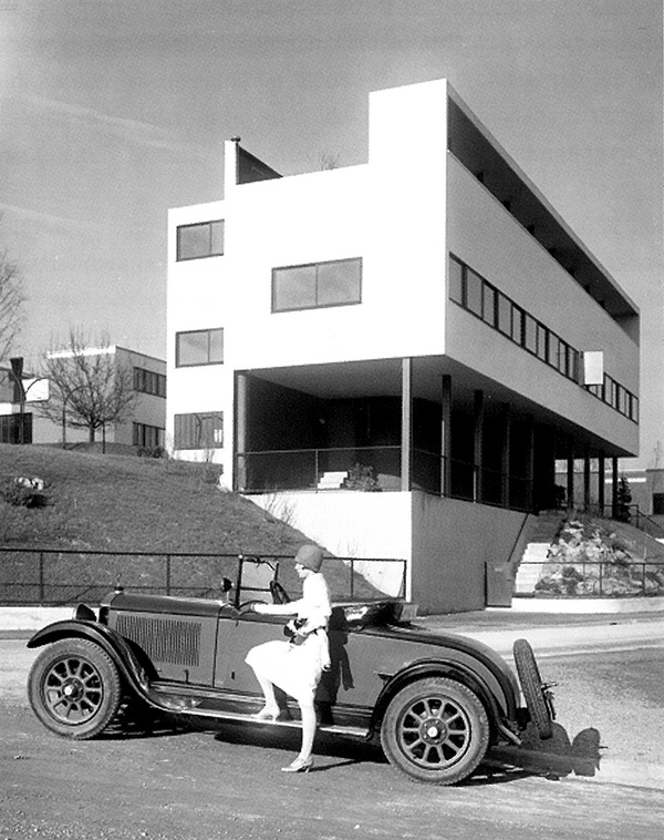
Le Corbusier. Weissenhofsiedlung, Stuttgart, 1927. With a Mercedes parked in front.
Architecture and film meet more directly in the modernist dispute over the “correct” form of the representation of architecture in the moving and the still image. Almost since the beginning of cinema, there has been a lively debate as to whether the moving image is friend or enemy of the architect when it comes to visually representing his or her buildings. Here the discussion of two-dimensional reproduction of three-dimensional space is revived but extended to include nonperspectival forms of representation, favoring a many-sided and multilayered perception of an object, as in cubism and expressionism. Among the architects, Taut took up the discussion in 1913 in an essay in Herwarth Walden’s Der Sturm, where he directly tackles the relationship between architecture and modern painting. Mentioning Fernand Léger, Franz Marc, Robert Delaunay, Heinrich Campendonk, Alexander Archipenko, and Wassily Kandinsky, he notes, “architecture a priori contains within itself the presupposition that the new painting has created: freedom from perspective and from the narrowness of the individual point of view. The buildings of the classic architectural epochs were invented without perspective, while perspective created only notorious theater-prop architecture [Kulissenschöpfungen].”16
Taut’s reflections are echoed by Lotz when the latter cites two examples of photographers offering “an approximation of filmic representation” by creating a series of consecutive views. In the case of one house designed by Taut,
[the photographer] advanced toward it incrementally from the countryside so that one perceives how it becomes more and more like a cube as one approaches it from a distance. In the second example, the photographer circled the house with his camera; by surveying the five ensuing photographs, one gains a sense of its corporeal physicality [Körperlichkeit]. For the representation of architectural objects, similar strips of images [Bildstreifen] may productively supplement larger pictures, which better show details.17
Confirming my earlier point about architects preferring strips of stills to moving images (in order to create the bodily sensation of movement, rather than expose their buildings to mechanical movement itself), Lotz also anticipates more-recent discussions about “new visuality” and “embodiment” and reflects the neoexpressionist discourse of the “architectural uncanny.”18 While these reappraisals of perspective, space, and movement enrich the debate over the affinity of modern architecture and cinema, they rarely take account of irritants, complications, and lacunae – precisely what allowed the architectural postcard to briefly emerge as a mass medium of modern architecture.
At issue are less the inherently “cinematic” qualities of the new architecture, or even the architects’ possible discomfort with the moving image, and more the question of why the modern movement – in all other respects made up of men who were masters at self-promotion – passed up an immensely popular medium such as the cinema to advertise their aims and achievements. My focus is on this gap between “control” and “access,” which I see as partly addressed (and filled) by the architectural postcard. For with the postcard, architects could have it both ways. Popular and with a potentially wide circulation, it gave architects a medium of motion and mobility while not obliging them to relinquish control over how their buildings were seen.
The modern postcard goes back to 1861 in the United States, to 1869 in Austria, and 1870 in Germany, when the single printed piece of card with specified dimensions was licensed by the (German) post office for private use.19 A by-product of the military (its trial run was as field post in the Franco-Prussian War), it was cheaper than a letter and permitted messages to circulate more quickly and more efficiently, thus gaining rapid popularity.20 But the postcard also opened up a new communication space between the private (breaking the much-prized confidentiality principle of the letter) and the public (the content of the message was now as accessible as the address).21 The ambivalence of public and private can be extended to a similar ambivalence concerning sender and addressee. Postcards soon became kitschy, frivolous, “naughty,” and often enough pornographic: ways of teasing prying eyes, embarrassing the addressee, and daring the censor.22 The pictorial riddle, the rebus picture, and the photomontage were favored visual modes and motifs. Thus, precisely because of the public nature of an essentially private communication, the message on a postcard has always had a particular rhetorical thrust, being as much a metamessage as a message: boast, boost, and self-advertising are never far, especially when the holiday postcard is sent from fabulous destinations and addressed to those unlucky ones who had to stay home.
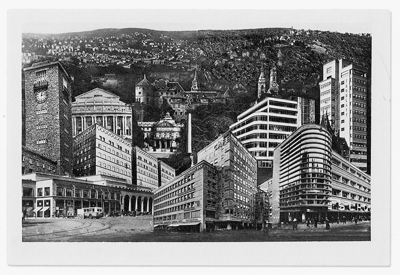
Unknown artist. Postcard with photomontage of buildings, Stuttgart, ca. 1931.
A similar principle obtains in the architectural postcard. But rather than showing a church, a local market, or the hotel, on which senders figuratively inscribe their own presence in order to gleefully or regretfully underline the addressee’s absence (“Wish you were here”), the architectural postcard obeys a symmetrical but inverted semiotic rule: the general absence of people makes the building into the dramatis persona, while its sculptural aspects (the angled or profile view) and monumental prominence (isolating it as much as possible from the surroundings) invites curiosity also by invoking the invisible presence of the building’s creator. The architectural postcard, more than just recording a visit by a tourist to an architectural site, functions as a calling card identifying the architect as author.
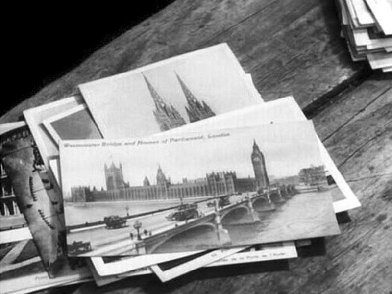
Jean-Luc Godard, dir. Les carabiniers, 1963. Frame enlargement.
The sculptural aspect – achieved at the price of voiding the site of the human user – is in some ways a provocation but also what most fascinates the eye. These postcards invite collection as much as sending. A fetishism of possession creeps into one’s gaze, as Jean-Luc Godard satirizes in Les carabiniers (1963). For his two protagonists, postcards are the spoils of war, and to own the picture is to possess what it represents. The image materializes the object in several respects: it makes it circulate at the same time it turns it into a commodity, but a commodity not so much bought and sold as endowing its decontextualized monumental presence with the potency of a fetish or totem.
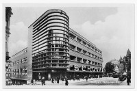
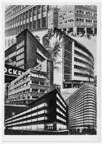
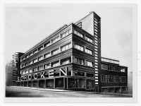
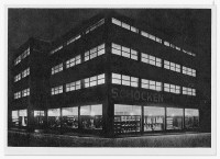
Architectural postcards were mass-produced to be handed out at trade fairs, sold on-site, or given away by the architect.23 Pioneers include Erich Mendelsohn and his clients, the Schocken Brothers. For the Schocken department-store chain in Germany, Mendelsohn designed distinctive buildings whose elegant curves and white bands of masonry alternating with broad expanses of glass virtually defined modern shopping. By incorporating the lettering into the façade and making sure the building looked as spectacular at night, when lit with neon lights, as it did in daytime when reflecting the sun, Mendelsohn underscored the tendency of architecture to become a visual medium in its own right, over and above serving as built space. Architecture now functioned in the multimedia context of photography, advertising, shopping, and urban living.24 The Schocken buildings, made famous through postcards (which were on sale and on display at the checkout counters in the stores), were among the first conceptual forays into an all-encompassing corporate design (after Peter Behrens and his AEG factories), in which the thrusting yet modulated outlines reproduced on the postcards were the key element. Architecture was at once trademark and advertisement: the logo was the building and the building the logo.
Here, then, is a popular, ephemeral medium (the postcard), serving another, more enduring medium (modern architecture), as both support and vehicle, creating an alliance but not disavowing their potentially antagonistic relation to each other. One of the first successful blends of the avant-garde and popular culture, the architectural postcard perhaps did so well in the late 1920s because several of the technical media – photography, design, architecture, typography, printing, and publishing – had by then begun to discover their mutual interdependence. Yet this interdependence conspicuously did not involve the cinema as either popular or avant-garde medium. Modernist design was shaping the cinema in the 1920s in outward appearance as well as inner form. The Berlin movie theaters built by Mendelsohn and Taut’s (unrealized) cinemas are architecture’s tribute to the new experience of lived time and imaginary space that was the movies.25 In turn, the films themselves repaid the compliment: Robert Wiene’s The Cabinet of Dr. Caligari (1920); Hans Poelzig’s sets for Paul Wegener’s The Golem (1920); Marcel L’Herbier’s L’inhumaine (1924, with sets by Robert Mallet-Stevens and Ferdinand Léger); and Fritz Lang’s Metropolis (1927) are among the usual suspects cited to prove the point.26
The reason modern architecture may nonetheless have preferred the humble postcard as the medium for its dissemination cannot be sought in any antagonism to cinema. One rather banal circumstance is that by the late 1920s, and especially after the coming of sound, fewer opportunities were left for showing documentary or experimental films as part of regular theater screenings. This led to a steep decline in the production of avant-garde cinema generally, which had to retreat to cine-clubs and specialized venues. Postcards, by contrast, offered cheaper, quicker, and more widely accessible means of publicizing the “New Vision” (Neues Sehen) of which the modern movement in architecture, along with photography and interior design, were such eloquent manifestations. Combining mobility (of the object) with fixity (of the view), the architectural postcard became a theoretical construct as well as a popular medium.
Given architectural modernism’s interest in movement, mobility of the gaze, and the human point of view, the modern movement’s deployment of the postcard as the medium of choice when offering a building to the beholder’s eye creates further ambivalence between movement and stasis. Ambivalence, rather than either rejection or embrace of the moving image. To understand what is at stake, who better to consult than Le Corbusier? On the one hand, he was the embodiment of the plan, the grid, and the cube. On the other hand, he was the advocate, if not the inventor, of the promenade architecturale. As “the observer’s pathway through the built space,” the architectural promenade named “the sequence of images that unfolds before the eyes of the observer as he or she gradually advances through the structure. It is the creation of a hierarchy among the architectural events, a set of instructions for reading the work.”27 The term is so often evoked because it seems to effortlessly and self-evidently make the case for Le Corbusier’s architecture (and, by implication, modern architecture generally) as a proto-cinematic experience, a sequence of frames or shots that each promeneur assembles into his or her own film.28 But we may be dealing with two kinds of cinema; or rather, two distinct visual dispositifs: a cinema for the eye, organized around the cinematic apparatus; and a cinema of the body, organized around the senses or, perhaps more accurately, around the body as total perceptual surface.29 The architectural postcard blends and blurs these two dispositifs, one focused on the disembodied “eye,” the other on the embodied senses. The postcard thus maintains both a normative position (its view is classically “centered”) and a subversive position (it wanders, circulates, is part of a relay) and thus breaks, in its reception, with the strict alignment of the geometry of the cinematic representation (the projecting cone) and the geometry of architectural representation (the angled view), to which it owes its production.
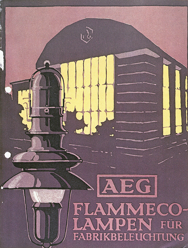
Peter Behrens. AEG turbine factory, Berlin, 1908. As shown on the cover of the brochure AEG Flammeco-Lampen (1913).
Yet, just as cinema did not always adhere to the rigid parameters of Renaissance monocular perspective (e.g., “Early Cinema,” the “cinema of attractions,” avant-garde practice in the 1920s and 1970s) and knew several “cinemas of the body” (e.g., “haptic cinema,” “the skin of film”), some architectural representations also broke with the classical rules of isometric and axonometric projections. Le Corbusier’s promenade architecturale is a reminder of such an “architecture of the body” – a point he made explicit when he remarked,
Arab architecture teaches us a valuable lesson. It is best appreciated on foot. Walking – you have to walk through a building with a changing viewpoint to see the articulation of the building deployed. It is the opposite to that of Baroque architecture, which is conceived on paper around the fixed vertical axis. I prefer the teaching of Arab architecture.30
That the “Arab village” should turn up as an insult in the context of rejecting the white-cube modernism of the Weissenhofsiedlung is more than a little ironic.
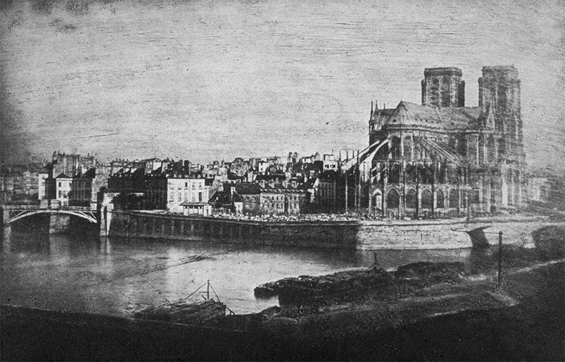
Louis-Jacques-Mandé Daguerre. Notre-Dame from the Pont des Tournelles, ca. 1838–1839.
In many respects, the architectural postcard is a subset of the larger and much better-known field of “architecture and photography,” a field that is as old as photography itself. After all, the first photographs were of buildings: a picture of a shed and a chestnut tree taken in 1826 and a picture of Notre Dame taken in 1838 and greeted by the Paris critic Jules Janin with the words, “Monsieur Daguerre ordered the towers of Notre Dame: Become Picture.”31 By 1905, stereoviews of landmark buildings were known to millions through the rotary viewing platform of August Fuhrmann’s Kaiserpanorama or (in the home) through the portable Holmes stereoscope.32
Yet, to my knowledge, among the many books devoted to architecture and photography, none deals with the architectural postcard.33 As a mass medium, it had a relatively short life before becoming a hobby and a collectors’ item.34 Nevertheless, the technological changes documented from the 1930s onward allow one to surmise that one of the reasons for the disappearance of the architectural postcard as a special genre is that architects were presented with another solution for making architecture mobile and circulatory while maintaining control over perspective and point of view. A new dispositif arose for modern architecture, one that superseded the postcard as promotional tool: the glossy magazine, defined by its shiny paper, high-quality photographs, and advertisements of luxury consumer goods and fashion. This new medium offered even wider dissemination and, perhaps just as important, a different configuration of image into object and object into image, bringing architecture ever closer to the commodity and to design, by entering into the domestic space of consumption and display while inserting itself into the space of fashion and news.
By the end of World War II, the architectural postcard had been replaced by the architectural photograph as the medium of choice for disseminating the International Style, thanks to better and cheaper offset lithographic printing technology. But no sooner was architecture’s new mass medium in place than another ambivalence arose, for one of the consequences was the emergence into prominence of the photographer, often anonymous in the days of the postcard but now, on the pages of the glossy magazine, a rival to the reputation of the architect. Take the case of Julius Shulman, an American photographer, who during the 1950s and 1960s worked closely with Frank Lloyd Wright, Charles Eames and Ray Eames, and Richard Neutra. Scholars still debate the extent to which the modern movement in the United States owes its success to photographs such as Shulman’s iconic shot of the Kaufmann House in Palm Springs, designed by Neutra, and published in numerous magazine spreads. Shulman’s authorship is even more in evidence in the so-called Case Study House #22, sometimes also known as the Stahl House (named after its first owner) and rarely mentioned under the name of its architect, Pierre Koenig. As the Wikipedia entry diplomatically states,
The clarity of Shulman’s work demanded that architectural photography had to be considered as an independent art form. Each Shulman image unites perception and understanding for the buildings and their place in the landscape. The precise compositions reveal not just the architectural ideas behind a building’s surface, but also the visions and hopes of an entire age. A sense of humanity is always present in his work, even when the human figure is absent from the actual photographs.35
But behind this “sense of humanity” were fierce power struggles and battles of egos, notably in the case of the Kaufmann House. The eponymous client at one point tried to prevent the pictures from being published, and Neutra was known to carry with him a laminated photo of a Time magazine cover with his own image on it so as to get preferential treatment on airplanes or a better table at Los Angeles restaurants.36 As one of Neutra’s biographers wrote,
Neutra incorporates so much of the ambivalence toward architectural photography that is currently manifested in the architectural community. His clear and elegantly phrased intellectual grasp of the limitations of architectural photography coexisted with a deep fascination with the way in which his architecture and, indeed, he himself were represented in photographic prints and the media.37
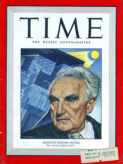
Richard Neutra on the cover of Time (15 August 1949).
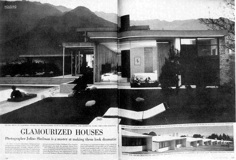
“Glamourized Houses,” Life (11 April 1949), featuring photographs by Julius Shulman. Top: Richard Neutra. Kaufmann House, Palm Springs, 1946.
Neutra’s ambivalence was not just a personal quirk arising from rivalry over authorship and attribution. The glossy magazine as mass medium determines much of the context within which architectural photography acquires its special status of exclusivity and style and, consequently, what kinds of meaning can be ascribed or attributed to a building’s appearance and layout on the page. No longer the diva ready for her close-up, it is now more the setting of beautiful people and beautiful objects, as magazine spreads of architecture tend to either include human beings or make their (temporary) absence more keenly felt. At the same time, each modern building thus featured invariably serves to advertise the group sensibility of the modern movement, with the magazine confirming the style as a brand and the brand endorsing the magazine. The magazine photograph takes the process of object merging into image and image merging into fetish one step further by embedding the transformation even more firmly in the circulation of commodities as images and images as commodities.38
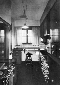
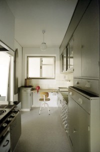
A somewhat different, if equally instructive, transubstantiation has taken place in the case of the Frankfurt Kitchen, the first functioning built-in or fitted kitchen, designed by Grete Schütte-Lihotzky for Ernst May’s housing developments in Frankfurt-Römerstadt and Ginnheim-Höhenblick. Some 15,000 units were built from 1928 to 1930 as part of an effort to provide affordable housing, the so-called “Living-Space for those on an Existential Minimum income.”39 The Frankfurt Kitchen is best known thanks to a photograph, taken by an unidentified photographer, that has been reproduced a hundred times in architectural histories, textbooks, exhibition catalogues, and, of course, Wikipedia. My interest in the kitchen was stirred by the fact that, in addition to the photograph, there is a film, until recently little known and even less studied.40 What I found in my research, however, was that the Frankfurt Kitchen was a mixed blessing for those living in the housing units. The inhabitants did not think of kitchens as machines for cooking but as the center of family life. For this, Schütte-Lihotzky’s design was not only too small but completely unsuitable. (Many occupants ripped out the kitchen or used it as a storage space.)41 The Frankfurt Kitchen thus owes much of its enduring fame to a photograph rather than to its functionality.42 However, since the late 1980s (and no doubt connected with the rise of installation art), just about every major museum has sought to acquire a Frankfurt Kitchen for its collection. The Minneapolis Institute of Arts has one, as does the Museum für angewandte Kunst in Vienna (Schütte-Lihotzky’s hometown), the Victoria and Albert Museum in London, and the Museum of Modern Art (MoMA) in New York, which prominently displayed the kitchen at its 2010 Counter Space exhibition.43 Some of the kitchens are “original,” some are reconstructions, and all are three-dimensional. Invariably, however, they are also reproduced in print in exactly the 2-D position made iconic through the historic photograph first printed in Das neue Frankfurt.44 Thus, this built(-in) architectural space became a photograph, and over time that photograph took on a reality of its own – so much so that at another point in time the photograph, in order to index its referent “authentically,” once more became (ex)posed space. That is, a nonfunctioning functionalist object became an image only for the image to become an installation.45
A further reason architectural photographs are so attractive but also so problematic as representation is the way the photographers are able to manipulate size, scale, and the impression of depth. In an insightful essay, Claire Zimmermann highlights the reciprocal but strategic relationship:
Architects need photography, not only to publicize their work but also to produce the visual evidence that lets them maintain themselves as architects on a world stage…. More than ever, the camera (and increasingly the computer, producing the digital model of the project that prefigures the photographs of the building to come) is a critical collaborator in the ongoing formation of architecture as a media-sensitive enterprise. And the discrepancies between photographic image and construction on the ground are now a presumptive condition of both practices.46
Zimmerman then documents how photographers from the 1920s onward played with scale in their compositions, used special lenses, and varied the physical point of view in order to convey the soaring power of skyscrapers and give added depth to domestic interiors.47
Crucial in this development, besides German precision optics, were some of the avant-garde practices of Weimar Germany’s photographers of the Neue Sachlichkeit, which Zimmerman typifies with three terms: “exaggeration, suppression, ambiguity.”48 These practices contrast intriguingly with some of the better-known principles of the “new objectivity,” such as functionality, sobriety, and formal minimalism, which may explain why these photographic methods often transferred quite seamlessly to the needs of the new regime after 1933. Wanting to show off their megastructures to optimum effect by playing on size and scale, Nazi architects, planners, and engineers retained many of the functionalist principles in industrial buildings and technical norms and designs.49 By showing only parts of a building and judiciously choosing the surroundings or eliminating context, effects of overpowering grandeur can be achieved, as in Ezra Stoller’s Dulles Airport Terminal photographs from 1964, but already practiced by Le Corbusier in 1920.50
The three ways in which, according to Zimmerman, architectural photography plays with our perception of scale are still with us today, albeit now manifesting themselves in a different medium – computer-aided design – that allows for an even broader spectrum of special effects by which to affect our sensation of presence and our experience of space: pulling us in by putting us at the apex of the visual cone while simultaneously overwhelming us. One conclusion to draw, then, is that the two visual dispositifs – the classic cinematic apparatus in it geometrical rigidity and optical fixity; and the promenade architecturale, with its ambulatory fluidity and peripatetic assemblage – are, thanks to cinema’s general relocation, no longer separate or opposed. A new ubiquity of cinema is evident on mobile screens, distributed in public, domestic, and art spaces, projecting or emitting images animated by the enhanced simulation techniques of digital software.
Among the phenomena that can be observed, I single out what I consider to be yet another reversal of the two-way transfer from object to image to object that characterizes the Frankfurt Kitchen and its photograph. In the case of this reversal, buildings are conceived with the image they want to produce of themselves already in mind. They are thus as much built to be seen with the photographer’s eye as they are built to be used or inhabited, since the manipulations of scale and size entered into their construction at the drawing stage.
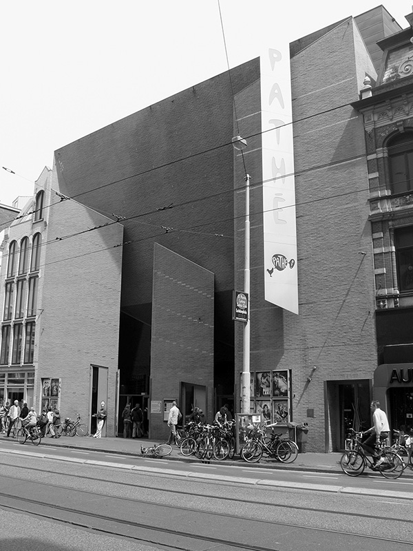
Christian de Portzamparc. Pathé De Munt, Amsterdam, 2000.
Consider the cinema building in Amsterdam that went up in 2000 in one of that city’s typical streets of steep, narrow houses. A multiplex with thirteen screens, it had to squeeze into a corner plot, extending in depth and height to fill the space of the respective back-houses, while having only a small part of the street frontage as its entrance. Designed by Georges van Delft and the French architect Christian de Portzamparc, the Pathé De Munt manages to do by itself and in real space what the architectural postcard used to do; namely, distort scale and exaggerate perspectival sight lines for added effect. A brutalist trompe l’oeil, the façade is slanted and angled (the return of the “relief”) so as to simulate a depth that is pure perspectival illusion.51 Best seen as one approaches it from across the street, the Pathé De Munt monumentalizes in brick and stone one’s anticipation of the Hollywood blockbuster about to be screened inside. But it also acknowledges the fact that our perceptual field is one in motion, and it has adjusted itself to photography’s way of seeing built space and the environment, now that the modern movement’s “new vision” has become the default value of human perception.
This is brought home most strikingly when one compares Portzamparc’s façade with Amsterdam’s other landmark cinema, the Pathé Tuschinski, no more than two hundred yards around the corner from the Pathé De Munt. A “spectacular mix of styles, as designed by Hijman Louis de Jong; Amsterdam School, Art Nouveau and Art Deco,” the Tuschinski has a magnificent façade.52 As that word implies, you need to face it frontally, get close, then crane your neck, step back, or otherwise displace yourself mentally and emotionally to take in its scale and detail, each requiring a different point of view and another way of seeing.
While preparing the illustrations for this article, many of the photographs I looked at online were found on Flickr, Instagram, and other photography websites to which users had uploaded their own photographs of architectural landmarks. I realized that – from the point of view of circulation and dissemination at least – these and other user-generated content sites may well be the heirs to the architectural postcard. Add the sort of software – from Adobe Photoshop to Microsoft Photosynth – that allows users to fashion three-dimensional renderings out of their own and other people’s holiday snaps of famous sites, and yet another popular mass medium for architecture is surely in the making.
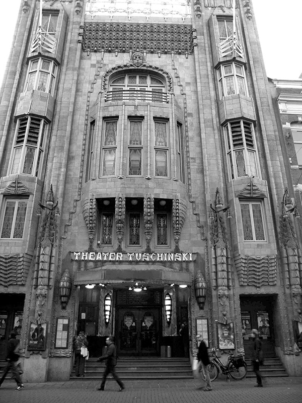
Hijman Louis de Jong. Pathé Tuschinski, Amsterdam, 1921.
Notes
Inspired by the journal Der Ring, the Weissenhofsiedlung project was one of the moments (along with CIAM and the League of Nations Competition) when modern architecture came to signify a group identity united by a particular sensibility, later dubbed the “modern movement.” See Giorgio Ciucci, “The Invention of the Modern Movement,” Oppositions 24 (Spring 1981): 68–91.
The more common denunciation of the modern movement was to refer to its buildings as a “Jerusalem suburb,” a phrase Paul Bonatz used when he attacked the Mies van der Rohe master plan for Weissenhof: “In vielfältigen horizontalen Terrassierungen drängt sich in unwohnlicher Enge eine Häufung von flachen Kuben am Abhang hinauf, eher an eine Vorstadt Jerusalems erinnernd als an Wohnungen für Stuttgart” (A cluster of flat cubic volumes arranged in variegated terraces are packed in an uncomfortably narrow manner up against a hill, reminiscent more of a Jerusalem suburb than dwellings in Stuttgart). Paul Bonatz, “Noch einmal die Werkbundsiedlung,” Schwäbischer Merkur, Abendblatt, 5 May 1926.
The invention of photomontage is claimed by the Berlin Dadaists and was never far from cinematic concerns and practices. Among numerous sources, see Brigid Doherty, “Berlin,” in Dada: Zurich, Berlin, Hannover, Cologne, New York, Paris, ed. Leah Dickerman (Washington, DC: National Gallery of Art, 2005), 87–112; and Andrés Zervigón, “A ‘Political Struwwelpeter’? John Heartfield’s Early Film Animation and the Crisis of Photographic Representation,” New German Critique 36, no. 2 (Summer 2009): 5–51. For a comprehensive account of the Weissenhofsiedlung and the controversies it provoked, see Richard Pommer and Christian F. Otto, Weissenhof 1927 and the Modern Movement in Architecture (Chicago: University of Chicago Press, 1991).
My research unearthed a number of films made in Frankfurt and elsewhere, but the general point remains, as these had little distribution or critical resonance at the time. See Thomas Elsaesser, “Bauen und Wohnen im nicht-fiktionalen Film der 20er Jahre,” in Der Dokumentarfilm in Deutschland: 1919–1933, ed. K. Kreimeier (Stuttgart: Reclam, 2005), 381–409; and Thomas Elsaesser, “Aus der Geschichte der Zukunft: Die Stadt von Morgen,” in Neues Wohnen 1929/2009, ed. Helen Barr (Berlin: Jovis, 2011), 14–26.
There have been frequent attempts to prove the uniquely “cinematic” quality of modernist architecture. See Eve Blau, “Transparency and the Irreconcilable Contradictions of Modern Architecture II,” in Crystal Clear Vision: Displaying Futures, ed. Antonia Henschel (Frankfurt: Trademark Publishing, 2015), 14–21; and Henry Keazor, “Projection Rooms,” in Immersion in the Visual Arts and Media, ed. Fabienne Liptay and Burcu Dogramaci (Leiden: Brill, 2016), 280–298. Especially notable in the German context are efforts to retrieve and revive the cinematic experiments around the Bauhaus, with László Moholy-Nagy and Oskar Schlemmer as key representatives. See Thomas Tode, ed., “bauhaus & film,” special double issue, Maske und Kothurn 57, no. 1–2 (2012). These rescue missions have produced excellent research, but the field of “cinema and architecture” is not part of my argument here.
On CIAM, see Eric Paul Mumford, The CIAM Discourse on Urbanism – 1928–1960 (Cambridge, MA: MIT Press, 2002). On CICIM, see Malte Hagener, Moving Forward, Looking Back: The European Avant-Garde and the Invention of Film Culture 1919–1939 (Amsterdam: Amsterdam University Press, 2007), 47–48, 145–148.
For Taut’s differentiated but still ambivalent relation to the moving image, see Andres Janser, “‘Die bewegliche kinematografische Aufnahme ersetzt beinahe die Führung um und durch einen Bau’ Bruno Taut und der Film,” in Bruno Taut 1880–1938, ed. Winfried Nerdinger, Kristiana Hartmann, Manfred Speidel, and Matthias Schirren (Stuttgart: Deutsche Verlags-Anstalt, 2001), 267–274. Mies van der Rohe’s attitude to film is discussed in Lutz Robbers, “Filmkämpfer Mies,” in Mies van der Rohe im Diskurs, ed. Kerstin Plüm (Bielefeld: Transcript Verlag, 2013), 63–96. In 1922, the film historian Oskar Kalbus reflected a common sentiment, when he wrote, “Die Baudenkmäler durch den Aufnahmeapparat von unten nach oben, von der einen Seite nach der anderen abzutasten, scheint mir schon deshalb unkünstlerisch und unwirklich, weil die Baudenkmäler im Film zu schweben und zu schaukeln anfangen und durch die Bildausschnitte überhaupt an Gesamtwirkung verlieren” (To scan the architectural monuments through the recording apparatus from the bottom to the top, from one side to the other, seems to me inartistic and unrealistic, because the monuments in the film begin to float and sway, losing their overall impact by being cut up into sections). Oskar Kalbus, Der Deutsche Lehrfilm in der Wissenschaft und im Unterricht (Berlin: Carl Heymann, 1922), 236.
This is a reference to Gloria Swanson in Billy Wilder’s Sunset Boulevard: “Mr. de Mille, I’m ready for my close-up.” Mies van der Rohe’s involvement with the photographs of his two most famous buildings is extensively discussed in Claire Zimmerman, Photographic Architecture in the Twentieth Century (Minneapolis: Minnesota University Press, 2014), 49–124.
Wilhelm Lotz, “Architekturfotos,” Die Form 4, no. 3 (1 February 1929): 69; and see the complete English translation included in this issue of Grey Room.
Such anxiety about movement is also reminiscent of Vidler’s argument about modernist agoraphobia. See Anthony Vidler, “Agoraphobia: Spatial Estrangement in Georg Simmel and Siegfried Kracauer,” in New German Critique, no. 54 (Autumn 1991): 31–45.
See Yve-Alain Bois and Michael Glenny, “Sergei Eisenstein, Montage and Architecture,” Assemblage 10 (December 1989): 110–131, referring to Sergei M. Eisenstein, “Montage and Architecture,” in Towards a Theory of Montage, vol. 2 of Selected Works, ed. Michael Glenny and Richard Taylor (London: British Film Institute, 1991), 59–81. For Le Corbusier, see Entretien avec les étudiants des écoles d’architecture (Paris: Éditions de Minuit, 1957). Both Eisenstein and Le Corbusier refer to Auguste Choisy’s Histoire de l’architecture, vol. 1 (Paris: Gauthier-Villars, 1899).
“I see the essence of the new architecture in the New Vision [das Neue Sehen], from which it is to be explained, and without which it cannot be properly understood. Whoever cannot see in a new way will not grasp the realities of this building. The new architecture takes movement as its normal state, and stasis as the exception. The rapid pace of our lives must be reflected in the way architecture is viewed and experienced.” Martin Elsaesser, “Modernes Architektursehen,” in Martin Elsaesser: Schriften, ed. Thomas Elsaesser, Wolfgang Sonne, and Jörg Schilling (Zurich: Niggli, 2014), 110; emphasis added. Unless otherwise noted, translations are my own.
Sigfried Giedion, Building in France: Building in Iron, Building in Ferroconcrete (1928), trans. J. Duncan Berry (Santa Monica, CA: Getty Center for the History of Art and the Humanities, 1995), 176.
Beatriz Colomina discusses Le Corbusier’s idiosyncratic uses of photographs in Privacy and Publicity: Modern Architecture as Mass Media (Cambridge, MA: MIT Press, 1996). In particular, she argues Le Corbusier manipulated photographic images of his built work to suit his self-presentation, retouching them to produce optimal views (101–118).
Antonio Amado, Voiture Minimum: Le Corbusier and the Automobile (Cambridge, MA: MIT Press, 2011).
Bruno Taut, “Eine Notwendigkeit,” Der Sturm 4, no. 196/197 (1913): 175.
Lotz, 70.
Jonathan Crary, “Modernizing Vision,” in Vision and Visuality, ed. Hal Foster (Seattle: Bay Press, 1988), 51–78; and Anthony Vidler, The Architectural Uncanny (Cambridge, MA: MIT Press, 1992), esp. 69–165.
For comprehensive (national) histories of the postcard, see Otto Wicki, Geschichte der Post- und Ansichtskarten (Bern: Zumstein, 1996); Martin Willoughby, A History of Postcards (London: Bracken Books, 1992); and Dan Friedman, The Birth and Development of American Postcards (West Nyack, NY: Classic Postcard Press, 2003). For a more media-philosophical take, see Bernhard Siegert, Relays – Geschichte der Literaturals Epoche der Post 1751–1913 (Berlin: Brinkmann und Bose, 1993), published in English as Bernhard Siegert, Relays: Literature as an Epoch of the Postal System, trans. Kevin Repp (Stanford: Stanford University Press, 1999), esp. 146–164. See also “Histoire de la carte postale,” Cartolis, http://www.cartolis.org/histoire.php; and “The History of Postcards,” Emotions Greeting Cards, Greeting Card Museum, http://www.emotionscards.com/museum/historyofpostcards.htm.
The war connection of the postcard is discussed in Marie-Monique Huss, Histoires de famille: Cartes postales et culture de guerre (Paris: Noesis, 2000).
Jacques Derrida calls the postcard “a letter to the extent that nothing of it remains…. It destines the letter to its ruin.” Jacques Derrida, The Postcard (Chicago: University of Chicago Press, 1987), 249.
“The exhibitionism practiced by the postcard was not lost on… the Director-General of the Postal Service, Philipsborn, who initially refused to introduce the postcard in 1865, arguing that the ‘open post-sheet’ was ‘an indecent form of communication.’ The nakedness of the means of communication, so Philipsborn’s reasoning, would serve nothing other than the communication of nakedness.” Siegert, Relays – Geschichte der Literatur als Epoche der Post 1751–1913, 160.
Rolf Sachsse, “Modern Greetings,” in Moderne Grüße/Modern Greetings, exh. cat., ed. Kirsten Baumann and Rolf Sachsse (Dessau: Arnoldsche, 2004), 202.
This argument is made by Colomina, Privacy and Publicity.
The literature on film theater architecture tends to take the form of coffee table books. Exceptions are Rolf-Peter Baacke, Lichtspielhausarchitektur in Deutschland: Von der Schaubude bis zum Kinopalast (Berlin: Fröhlich und Kaufmann, 1982); and William Paul, When Movies Were Theater: Architecture, Exhibition, and the Evolution of American Film (New York: Columbia University Press, 2016). See also François Penz and Maureen Thomas, eds., Cinema and Architecture: Méliès, Mallet-Stevens, Multimedia (London: British Film Institute, 1997).
Among the extensive literature on film architecture, see Robert Mallet-Stevens, Le décor moderne au cinéma (Paris: Charles Massin, 1928); Léon Barsacq, Caligari’s Cabinet and Other Grand Illusions: A History of Film Design (Boston: New York Graphic Society, 1976); Helmut Weihsmann, Gebaute Illusionen: Architektur im Film (Vienna: Promedia, 1988); and Dietrich Neumann, Filmarchitektur: Von METROPOLIS bis BLADE RUNNER (Munich: Prestel, 1996).
Flora Samuel, Le Corbusier and the Architectural Promenade (Basel: Birkhäuser, 2010), back cover blurb. Also, on page 9: “The ‘promenade architecturale’ … [which] appears for the first time in Le Corbusier’s description of the Villa Savoye at Poissy (1928) where it supercedes the term ‘circulation,’ so often used in his early work. ‘In this house occurs a veritable promenade architecturale, offering aspects constantly varied, unexpected and sometimes astonishing.’ Taken at a basic level the promenade refers, of course, to the experience of walking through a building. Taken at a deeper level, like most things Corbusian, it refers to the complex web of ideas that underpins his work, most specifically his belief in architecture as a form of initiation.”
For a sophisticated argument aligning Le Corbusier’s Harvard Carpenter Center with a cinematic architectural experience, see Stan Allen, “Le Corbusier and Modernist Movement,” in Practice, Architecture, Technique and Representation (New York: Routledge, 2008), 103–122.
I call them dispositifs, in Foucault’s sense, because each is an assemblage of disparate elements in view of producing a series of effects and exerting forms of power or control. See Gilles Deleuze, “What Is a Dispositif?” in Michel Foucault: Philosopher, trans. T.J. Armstrong (New York: Harvester Wheatsheaf, 1992).
Le Corbusier, Œuvre Complète, 1929–1934, vol. 2, 7th ed. (Zurich: Les Éditions d’Architecture, 1964), 24.
Quoted in Sachsse, “Modern Greetings,” 186.
“The first effect of looking at a good photograph through the stereoscope is a surprise such as no painting ever produced. The mind feels its way into the very depths of the picture…. Then there is such a frightful amount of detail, that we have the same sense of infinite complexity which Nature gives us… the stereoscopic figure spares us nothing – all must be there, every stick, straw, scratch, as faithfully as the dome of St. Peter’s, or the summit of Mont Blanc, or the ever-moving stillness of Niagara.” Oliver Wendell Holmes, “The Stereoscope or the Stereograph,” The Atlantic 3, no. 20 (June 1859): 738–748. On the Kaiserpanorama, see Dieter Lorenz and Ulrich Pohlmann, Das Kaiserpanorama: Ein Unternehmen des August Fuhrmann (Munich: Münchner Stadtmuseum, 2010); and Bernd Poch, “Das Kaiserpanorama: Das Medium, seine Vorgänger und seine Verbreitung in Nordwestdeutschland,” [n.d.], http://www.massenmedien.de/kaiserpanorama/ emden/emden.htm.
Among the many studies of the architectural photograph, two histories stand out: Richard Pare, Photography and Architecture: 1839–1939 (Cambridge, MA: MIT Press, 1985); and Cervin Robinson and Joel Herschman, Architecture Transformed: A History of the Photography of Buildings from 1839 to the Present (Cambridge, MA: MIT Press and the Architectural League, 1987). Erich “Manny” Abraben, Point of View: The Art of Architectural Photography (Oxford, UK: Wiley, 1993) is symptomatic for its title (“point of view”) and details both technical and aesthetic advice aimed at the practicing photographer. The most comprehensive historical-critical study is Zimmerman, Photographic Architecture in the Twentieth Century.
Offered in sets, architectural postcards regularly turn up at auctions, along with stamps and coins, such as this set of fourteen postcards featuring the buildings of Hans Scharoun: Auktionshalle Cuxhaven, lot 236-15047, http://www.shop-antik.de/epages/78084993.sf/de_DE/?ObjectPath=/ Shops/78084993/Products/1070553. Sometimes they are advertised as “gorgeous vintage postcards of incredible architecture.” See Claire Cottrell, “Gorgeous Vintage Postcards of Incredible Architecture,” Flavorwire, 30 January 2013, http://flavorwire.com/367680/gorgeous-vintage-postcards-of-incredible- architecture-around-the-world.
“Julius Shulman,” Wikipedia, last updated 30 June 2017, https:// en.wikipedia.org/wiki/Julius_Shulman.
As reported by Norman Cousins and cited in Simon Niedenthal, “‘Glamourized Houses’: Neutra, Photography, and the Kaufmann House,” Journal of the Society of Architectural Historians 47, no. 2 (November 1993): 109.
Niedenthal, 101–112.
The exchange object to image and the implied transfer of value as well as reality status was recognized by Oliver Wendell Holmes in his 1859 essay “The Stereoscope or the Stereograph”: “Form is henceforth divorced from matter. In fact, matter as a visible object is of no great use any longer, except as the mould on which form is shaped. Give us a few negatives of a thing worth seeing, taken from different points of view, and that is all we want of it.” Holmes, 747.
Less well-known is the fact that 832 of the 15,000 units were built with modular construction methods. Experimental, expensive, and prototypical, they were pushed by Ernst May not least in order to impress delegates of the CIAM conference, held in Frankfurt in 1929, for which May was organizing the exhibition Die Wohnung für das Existenzminimum. See Eugen Kaufmann, “Die Internationale Ausstellung ‘Die Wohnung für das Existenzminimum,’” Das neue Frankfurt 11 (November 1929): 213–217; and Helen Barr, ed., Neues Wohnen 1929/2009 Frankfurt und der 2. Congrès International d’Architecture Moderne (Frankfurt: Jovis, 2011). See also the film Die Häuserfabrik der Stadt Frankfurt, part four of Neues Bauen in Frankfurt a./M. (dir. Paul Wolff[?], 1928). On the latter, see Leonardo Ciacci, “A New Way of Building in Frankfurt – 1928,” Planum: The Journal of Urbanism, http://www.planum.net/neues-bauen-in-frankfurt-am-main-a-new-way-of-building-in-frankfurt.
Die Frankfurter Küche, part two of Neues Bauen in Frankfurt a./M. The film can be found on Vimeo.
Gerd Kuhn, “Die Frankfurter Küche,” in Wohnkultur und kommunale Wohnungspolitik in Frankfurt am Main 1880–1930 (Bonn: J.H.W. Dietz, 1998), 163–167.
Thomas Elsaesser, “The Camera in the Kitchen: Grete Schütte-Lihotzky and Domestic Modernity,” in Practicing Modernity: Female Creativity in the Weimar Republic, ed. Christiane Schönfeld (Würzburg: Königshausen und Neumann, 2006), 27–49.
The exhibition Counter Space: Design and the Modern Kitchen took place from September 15, 2010, to May 2, 2011, at MoMA. See Juliet Kinchin and Aidan O’Connor, Counter Space: Design and the Modern Kitchen, exh. cat. (New York: Museum of Modern Art, 2011).
Das neue Frankfurt 1, no. 5 (1927).
A similar argument is made for Thomas Demand in Colomina, “Media as Modern Architecture,” in Architecture between Spectacle and Use, ed. Anthony Vidler (New Haven and London: Yale University Press, 2008), 58–73.
Claire Zimmerman, “The Monster Magnified: Architectural Photography as Visual Hyperbole,” special issue “Monster,” ed. Marc Guberman, Jacob Reidel, and Frida Rosenberg, Perspecta 40 (2008): 136.
For instance, Zimmerman notes that in the photographs Mies commissioned of the Tugendhat Villa, the use of the wide-angle lens substantially alters the physical space, taking the viewer “into” what she calls, in another essay, “the new deep”: “The wide-angle lens… helps construct photographic bigness by altering the dimensional appearance of architecture. In the case of interior photography, it expands the cone of vision into a trumpet shape that grabs more at its outer edges (close to the camera) and compresses more distant objects at its center. This results in a substantial dimensional alteration to any architectural object…. Thus while the space appears deeper, it also appears lower, or narrower, than expected, with an enlarged foreground in which various sorts of haptic effects may be staged to draw the viewer into the body of the trumpet-shaped beast more effectively.” Zimmerman, “The Monster Magnified,” 140. For “the new deep,” see Claire Zimmerman, “Photographic Modern Architecture: Inside ‘The New Deep,’” Journal of Architecture 9 (2004): 331–354.
Zimmerman, “The Monster Magnified,” 140.
Zimmerman cites the Zeppelinfeld and Congress Hall in Nuremberg, as well as one of Paul Bonatz’s Autobahn bridges near Limburg in Hesse. Zimmerman, “The Monster Magnified,” 140.
Colomina demonstrates this point in her analysis of the architect’s photographic presentation of the Villa Schwob, one of his first buildings. Colomina, Privacy and Publicity, 107–111.
The conservative Dutch press was far from enthusiastic about the new building, criticizing as awkward and clumsy the play with hyperboles of scale and shape. The façade, too, came in for ridicule, denounced as a “cardboard box garishly lit.” Bernard Hulsman, “Bordkartonnen doolhof in knallende kleuren,” NRC Handelsblad, 16 November 2000, http://retro.nrc.nl/W2/ Nieuws/2000/11/16/Vp/07.html.
“Tuschinski,” Wikipedia, last updated 1 March 2017, https://en. wikipedia.org/wiki/Tuschinski.
